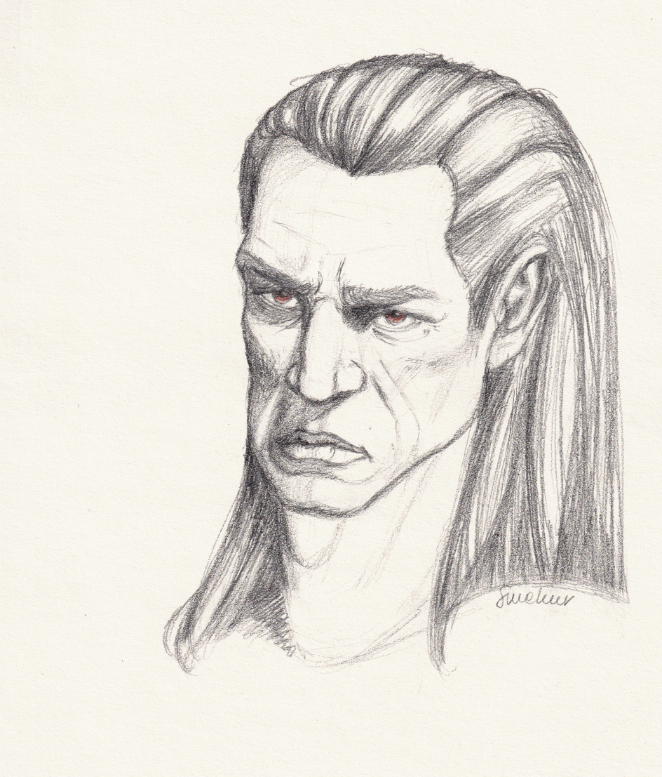
This looked so much better while I was drawing it than when I posted it. How is it that I get to see so many mistakes after I post a thing? Like, here’s what I see:
- The farther side of his face is somehow taller than the closer one.
- The mouth is too low.
- The mouth is too downcast. Even with a frown, it should curl up, following the spherical form of the muzzle.
- The muzzle is too flat.
- The right eye is too big.
- The right eye is also too white. Should’ve shaded the sclera.
- The neck seems too large (both too long and too thick) compared to head.
I do like the hair, but it’s not on model – should be shorter and curl backward.
As I said elsewhere, an attempt was made. ¯\_(ツ)_/¯

Leave a Reply